A Sauv Blanc Design Standout
We partnered with Deutsch Family Wine & Spirits to refresh The Crossings brand and grow off-premise sales..
Capabilities
PORTFOLIO ARCHITECTURE
DESIGN STRATEGY
PACKAGE DESIGN
Challenge
Deutsch Family Wine & Spirits is the U.S. sales and marketing arm for The Crossings, a premium New Zealand wine brand with strong ambitions for growth. The brand has historically performed well in the on premise channel, but was hit hard by COVID related closures and declines in on-premise sales. With competition intensifying in the New Zealand wine category, The Crossings needed a way to stand out at retail. The challenge was to create a breakthrough label for its Sauvignon Blanc, which accounts for 99% of the brand’s volume, and give consumers a reason to choose The Crossings over more heavily advertised competitors.
Action Taken
DuPuis partnered with The Crossings and its research teams to develop a standout label, validated by consumers, that connects the brand to its roots in the riverside vineyards of Marlborough’s Awatere Valley. We began by developing several initial label concepts inspired by the idea of crossing over to the purest expression of New Zealand.
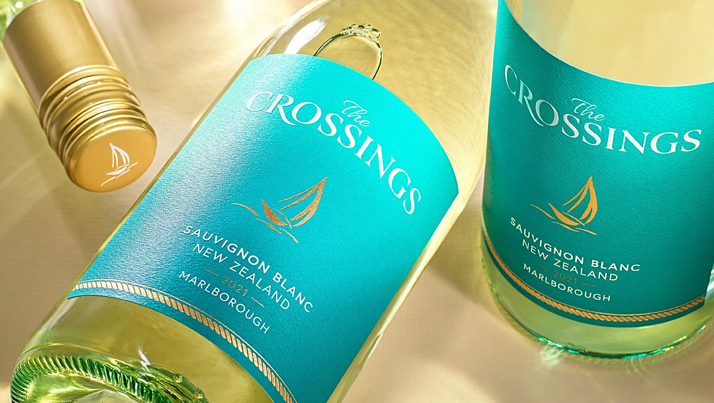
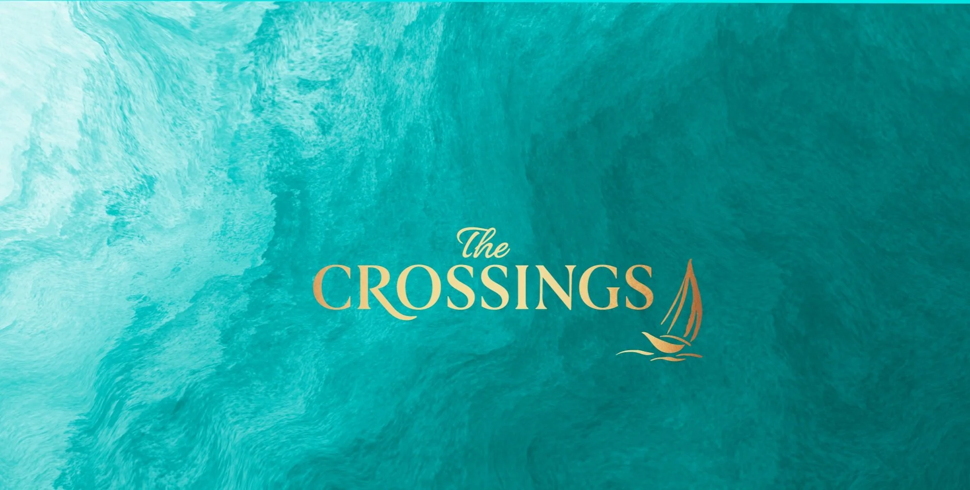
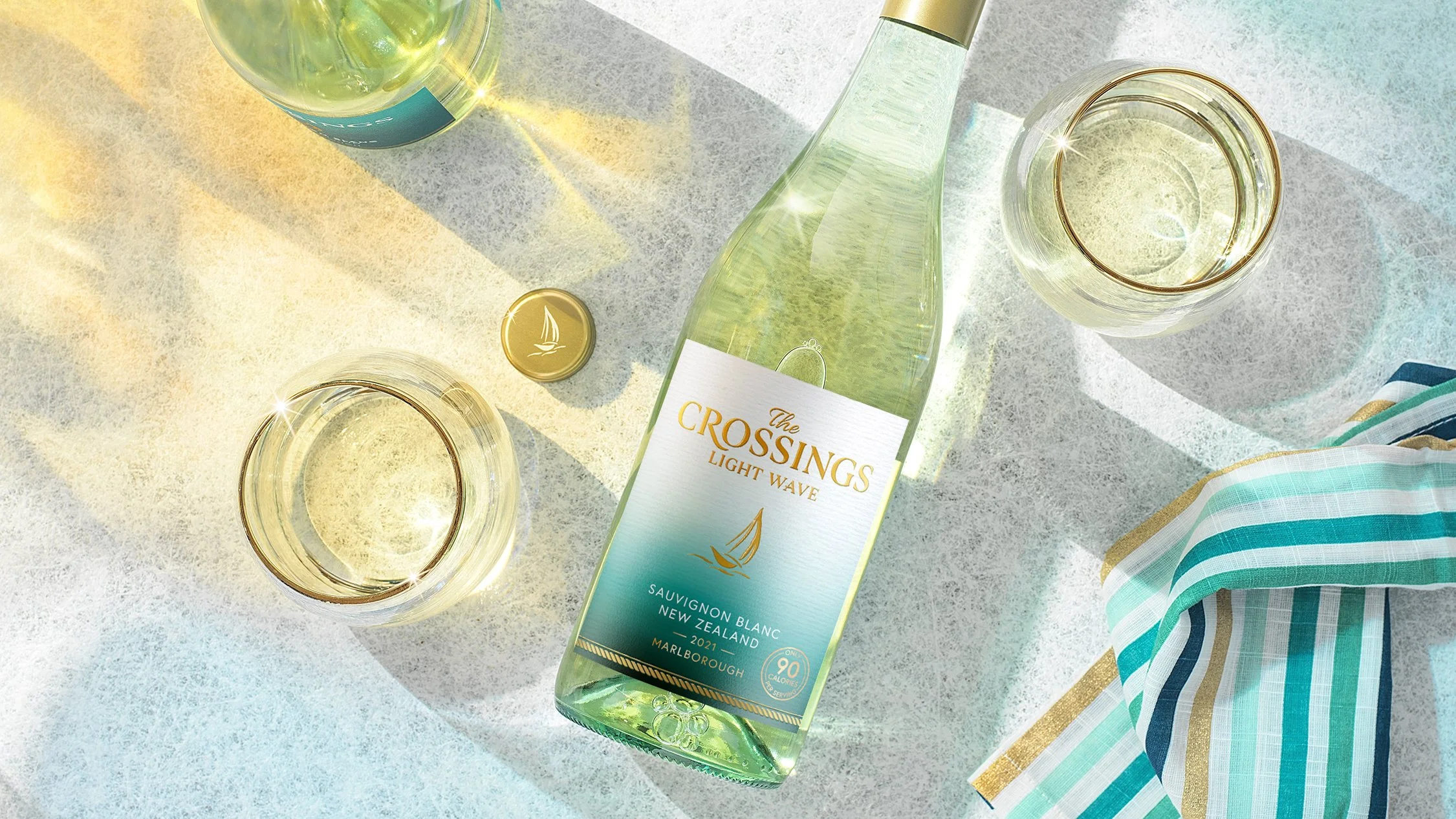
Through an iterative design process, guided by both qualitative and quantitative consumer research, we refined the concept into a distinctive visual identity. The final Sauvignon Blanc label features a rich teal gradient that conveys freshness and flavor, while the elegant script logo and gold foiled sailboat pay tribute to the winery’s river heritage and premium craftsmanship.
Results
The redesigned Sauvignon Blanc debuted with the 2021 vintage and has since become the flagship identity for The Crossings, expanding into additional varietals, including Light Wave Sauvignon Blanc. The design won GDUSA 2023 award.
You May Also Like