The Perfect Pairing
We partnered with Frito Lay to refresh the Stacy’s brand with a creative canvas that allows it to aspire toward endless possibilities.
Capabilities
PORTFOLIO ARCHITECTURE
DESIGN STRATEGY
VISUAL IDENTITY
PACKAGE DESIGN
Challenge
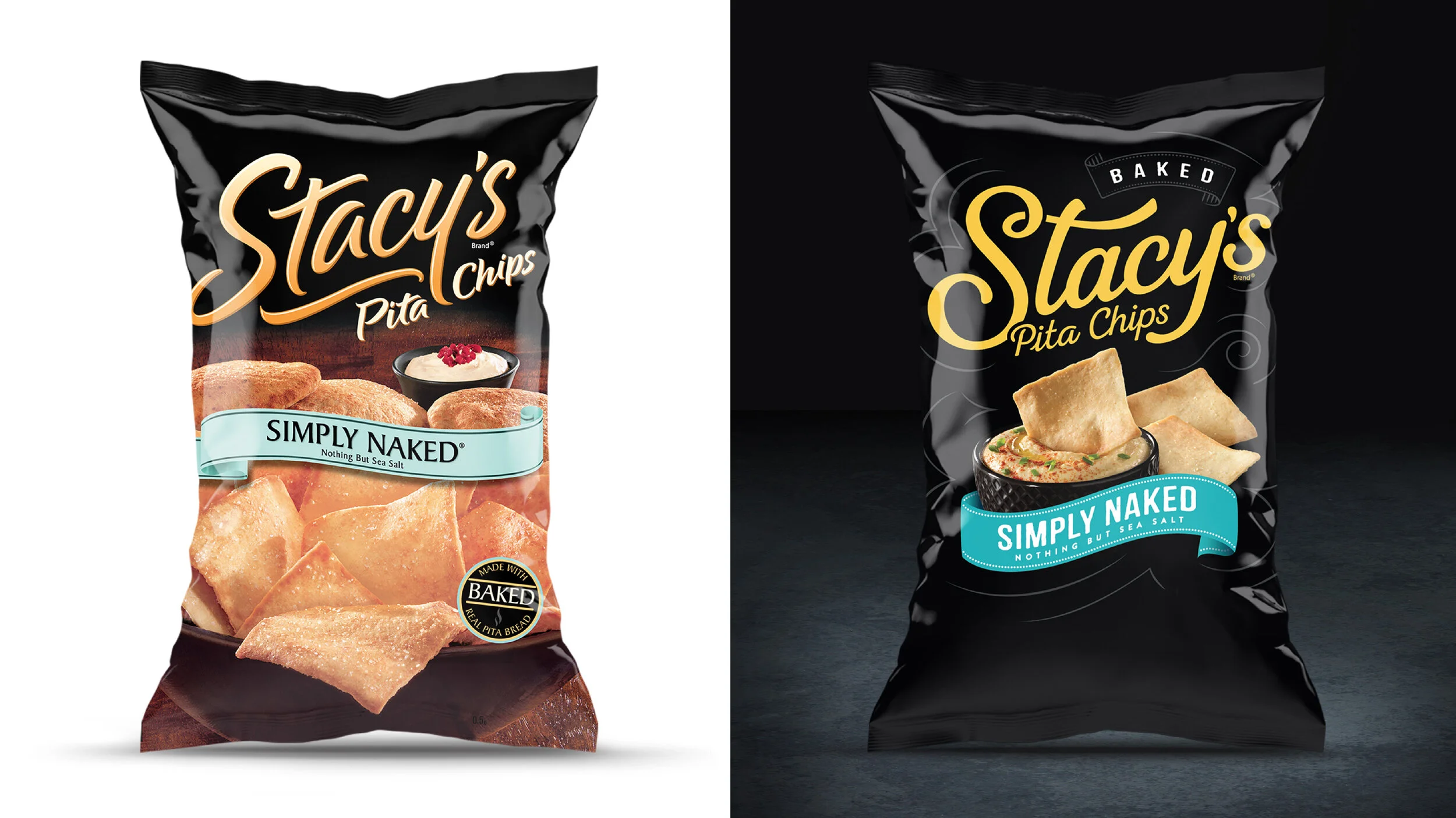
As Frito Lay’s flagship deli brand, Stacy’s had built a loyal following among women looking for a more premium snacking experience. But the packaging focused primarily on the chips themselves, missing an important part of how consumers actually enjoyed the product.
Through consumer research, DuPuis uncovered a simple insight: Stacy’s was the kind of chip that deserved a fabulous dip. That idea became the starting point for rethinking the brand.
Action Taken
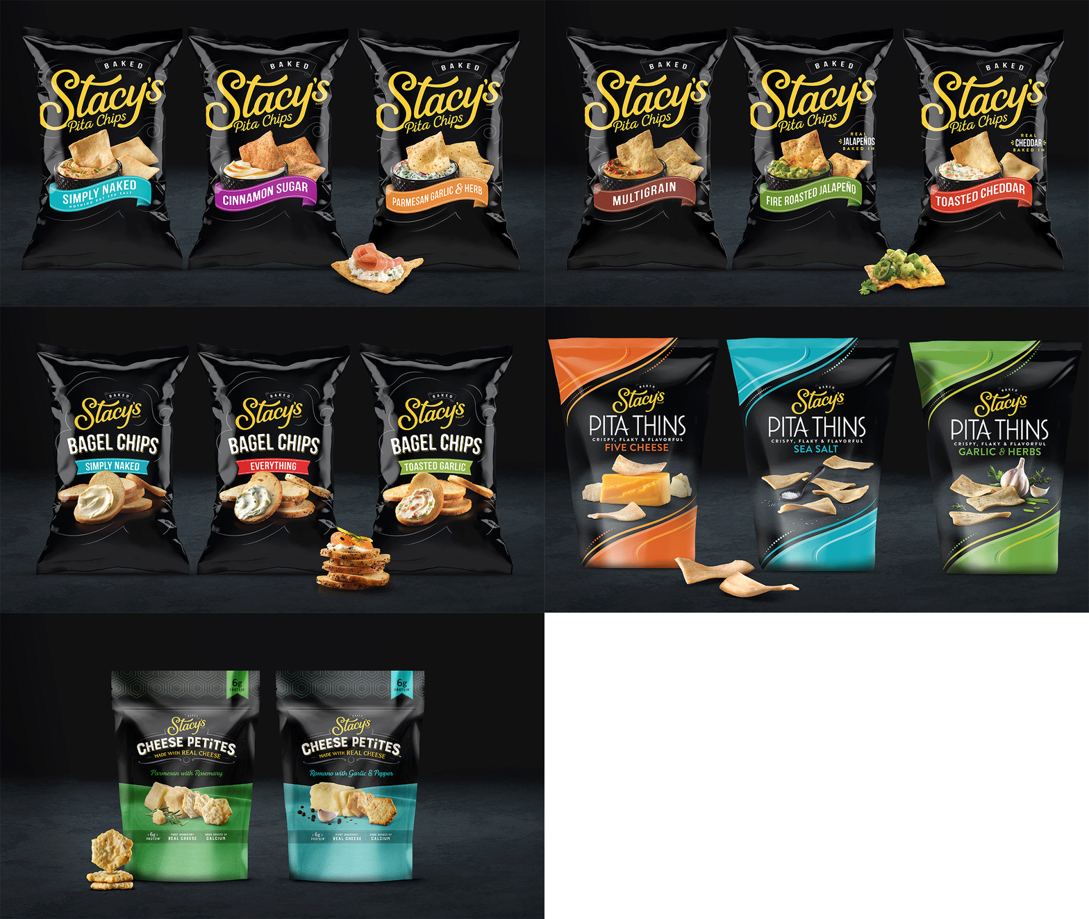
Building on this insight, DuPuis reimagined the Stacy's brand to celebrate the ritual of pairing pita chips with a delicious dip. We modernized the identity with refined typography, elevated appetite appeal through culinary inspired photography, and, for the first time, made the dip as much the hero as the chip, transforming the package into an invitation to a more inspired snacking experience.
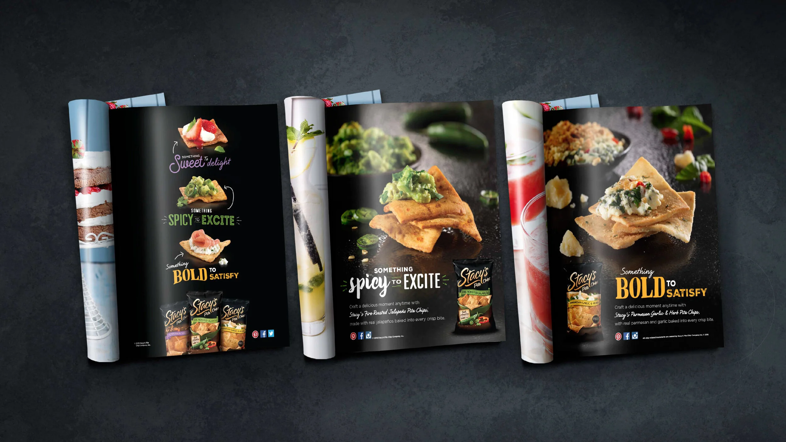
The "Perfect Pairings" idea became far more than a packaging redesign. It evolved into the brand's creative platform, inspiring advertising, shopper marketing, in store activation, seasonal promotions, and portfolio innovation, while establishing a design language that continues to define Stacy's more than a decade later.
Results
The redesign established a timeless brand platform that continues to shape Stacy's more than a decade later. Built on the simple insight that great pita chips deserve a great dip, the visual identity remains remarkably true to the original concept, while the "Perfect Pairings" campaign delivered the highest PRS advertising score in Frito Lay history at the time.
You May Also Like